19. Factor Analysis (Dimensionality Reduction)#
# Import some helper functions (please ignore this!)
from utils import *
from cs349 import *
Context: As we found in the chapter on Gaussian Mixture Models (GMMs), our data might contain latent structure. In the IHH context, for example, each patient can be described by some underlying condition that explains their data, where there’s a fixed number of possible conditions. However, what happens if the hidden structure is not discrete, but is continuous. By this, we mean that, instead of supposing there exists a discrete number of latent underlying patient conditions, there may be a spectrum of underlying conditions. Every patient lies somewhere on this spectrum, and our goal uncover it.
Challenge: In order to place patients on this “spectrum,” we’ll have to use a continuous latent variable. We will introduce a new model, called Factor Analysis, which does exactly this. However, when using a continuous latent variable, we’ll run into some challenges. First, we’ll notice that we need a continuous version of the law of total probability. Second, we’ll need some efficient computational scheme to apply the law of total probability in practice.
Outline:
Introduce the Factor Analysis model
Introduce the continuous version of the law of total probability
Implement Factor Analysis in
NumPyro
Data: In the past week, the IHH has been hit hard by some unknown disease, spreading through the in-patient population. The IHH’s Center for Epidemiology has recently been tasked with understanding the disease and stopping its spread. You’re already attempted to group patients using their symptoms. In their newest effort, they’ve been taking patient saliva samples and screening them under a microscope to understand what’s going on. They sent you a data set consisting of microscope images—each \(24 \times 24\) in size (576 pixels in total)—in which each pixel takes on values from \(0.0\) to \(1.0\) (black to white). To summarize, each observation, \(x_n\) is a 576-long array of values between \([0, 1]\): \(x_n \in [0, 1]^{567}\).
You opened one of the microscope images and here’s what you found:
import jax.numpy as jnp

# Load the data
data = jnp.load('data/microscope.npy')

# Visualize one of the microscope images
visualize_microscope_samples(data[:1])

The microscope image actually shows an intergalactic virus! And this specific intergalactic virus seems to be wearing a hat! If it weren’t for the epidemic at the IHH, this would have been super cute. Let’s have a look at a bunch more of these.
visualize_microscope_samples(data[:100])
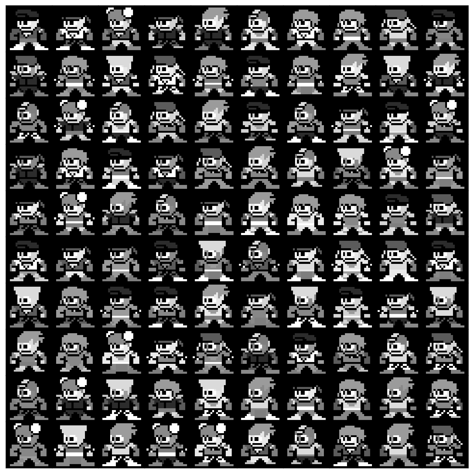
It seems like we have a whole collection of viruses here, each different, and wreaking havoc in a different way. Your colleagues at the Center for Epidemiology have limited bandwidth. They can’t possibly look at every virus sample collected from every patient to understand the various mechanisms that cause the disease. As such, they’ve enlisted you to help them out. They hypothesize that although these viruses look different, most aren’t important for the presentation of the disease. As such, they would like you to learn a low-dimensional representation so that they can better explore these viruses.
Acknowledgements. Data adapted from this repository.
19.1. Factor Analysis Model#
Data Generating Process. So how can we help our IHH colleagues? Let’s think about their hypothesis. They said they believe there the data can actually be represented by a small number of dimensions. Using this idea, let’s assume our data was actually generated by a distribution on a low dimensional space. For simplicity, let’s go with a 2-dimensional Gaussian with unit variance:
\(Z\) represents our latent variable, since we never actually observed it—we only observed the high-dimensional microscope images. To make notation easier, we will denote square matrices with 1s along the diagonal and 0s everywhere else with \(I_d\) (this is called the identity matrix). We will use the subscript-\(d\) to denote the size of the matrix. Using this notation, we have:
where \(0\) is now an array of 0s that matches the size of \(I_2\) (i.e. it’s a 2-dimensional array).
Next, we need some way of translating the latent variable into our observed variable. That is, we need to specify the distribution of the observed data given the latent variable:
where \(\theta\) are the parameters of the distribution. We can do this by assuming there exists some function \(f(\cdot; W)\), with parameters \(W\), that maps the low-dimensional latent space to the high-dimensional observation space. In our case, \(f(\cdot; W)\) will map a 2-dimensional space to a 576-dimensional space: \(f: \mathbb{R}^2 \rightarrow [0, 1]^{576}\). This function can be anything we’d like it to be. In many applications of factor analysis (e.g. in psychology), it’s common to use a linear function; however, for image data, like in our case, it’s better to use a non-linear function. We will use a neural network.
We can then assume that there’s some “observation error” (e.g. microscope inaccuracies) that corrupt the translation from the low-dimensional space to the observed space. As is common in factor analysis, we’ll go with a multivariate Gaussian for now:
where \(\theta = \{W, \sigma \}\) are our model parameters, and \(\sigma^2 \cdot I_{576}\) is a matrix of \(\sigma^2\) along the diagonal and 0s everywhere else. This covariance matrix indicates that the observation errors for each pixel are uncorrelated. Lastly, we often call \(f(\cdot; W)\) the “decoder,” since it decodes the compressed, low-dimensional representation of the data into the original, high-dimensional representation.
Putting this all together, we have the following generative process:
Directed Graphical Model. Depicting this generative process as a DGM, we have:
Apart from the parameters, you can see that this model is identical to that of a GMM. The only differences are that:
The latent variable is continuous in the factor analysis model, while its discrete in a GMM.
A factor analysis model uses a fancy function \(f(\cdot; W)\) to map samples from the latent space to the observed space. In contrast, in a GMM, samples from the latent space are discrete—they are used to choose which “cluster” to use to sample the observed data.
Intuition. Let’s instantiate the above model for a simple, low-dimensional example. We’ll then generate data from this model to gain some intuition. We’ll start by assuming a distribution over a 1-dimensional latent space:
Let’s define and visualize this distribution in NumPyro:
# Define the distribution over Z
p_z = D.Normal(0.0, 1.0)


# Plot its PDF
fig = plt.figure(figsize=(4, 3))

# The support from a Gaussian is the entire real line.
# Here we'll plot it only where it's interesting
z_support = jnp.linspace(-3.5, 3.5, 100)
plt.plot(z_support, jnp.exp(p_z.log_prob(z_support)))

plt.xlabel(r'$z$')
plt.ylabel(r'$p_Z(z)$')
plt.title('Distribution of Latent Variable')

plt.tight_layout()
plt.show()
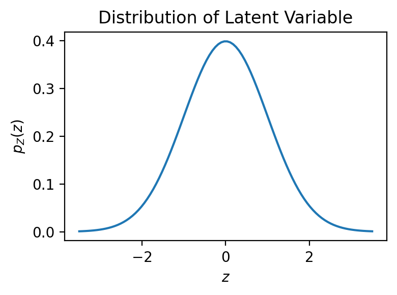
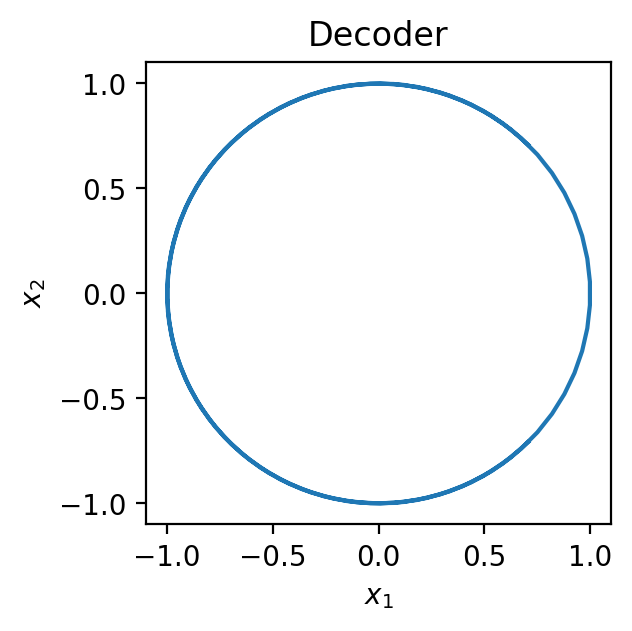
Next, we define our decoder. Since a decoder typically maps a low dimensional latent space to the higher-dimensional observation space, we’ll generate observations in 2-dimensions. Specifically, we’ll go with a decoder that maps the 1-dimensional space to a 2-dimensional circle.
Let’s implement this decoder and visualize what it does to the latent samples:
def decoder(z):
    # Expects z to be of shape (N,)
    # Reshapes z to be of shape (N, 1) so we can concatenate it along the last axis
    z = z[..., None]

    # Compute each dimension of the observed data, x
    x1 = jnp.cos(0.5 * jnp.pi * z)
    x2 = jnp.sin(0.5 * jnp.pi * z)

    # Concatenate the dimensions of x into a single vector
    return jnp.concatenate([x1, x2], axis=-1)


# Decode each point in the latent space to the observation space
mu_support = decoder(z_support)

# Plot
fig = plt.figure(figsize=(3, 3))

plt.plot(mu_support[:, 0], mu_support[:, 1])

plt.xlabel(r'$x_1$')
plt.ylabel(r'$x_2$')
plt.title('Decoder')
plt.show()
Finally, let’s define the conditional distribution of \(X\) given \(Z\):
where \(\sigma = 0.1\). This distribution will add Gaussian noise around the circle. Let’s sample from the generative process to see what this looks like:
# Define random generator keys for sampling
key = jrandom.PRNGKey(seed=0)
key_z, key_x = jrandom.split(key, 2)

# Choose number of samples to draw
N = 500

# Draw samples of the latent variable
z = p_z.sample(key_z, (N,))

# Decode them
mu = decoder(z)

# Define and sample from the conditional distribution of X given Z
# Notice that we didn't use D.MultivariateNormal -- we'll explain why below
p_x_given_z = D.Normal(mu, 0.1 * jnp.ones(2)).to_event(1)
x = p_x_given_z.sample(key_x)

# Plot
fig = plt.figure(figsize=(5, 5))

plt.scatter(mu[:, 0], mu[:, 1], label=r'$f(\cdot; W)$')
plt.scatter(x[:, 0], x[:, 1], color='red', alpha=0.5, label=r'$x_n$')

plt.xlabel(r'$x_1$')
plt.ylabel(r'$x_2$')
plt.title('Samples from Factor Analysis Model')
plt.legend()
plt.tight_layout()
plt.show()
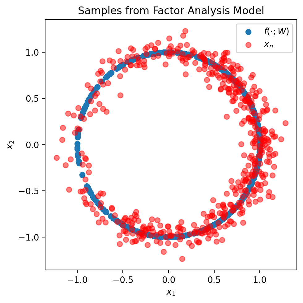
As you can see, the Factor Analysis model is quite powerful. It allows us to specify all sorts of interesting distributions (like a distribution on a circle).
Multivariate Normals in NumPyro. You may have noticed above that, even though \(p_{X | Z}\) is a multivariate normal, we didn’t use D.MultivariateNormal when defining it in NumPyro. In many cases, we just need a multivariate normal with a diagonal covariance (i.e. \(I\)), as we did for both \(p_Z\) and \(p_{X | Z}\). In these cases, there is a more stable and efficient way to construct multivariate normals in NumPyro using D.Normal. Please use the method we introduce here.
Suppose we wanted to implement the following multivariate normal distribution in NumPyro:
This is the corresponding NumPyro code:
mvn = D.Normal(
    jnp.array([-2.0, 1.0]),
    jnp.array([0.5, 3.0]),
).to_event(1)
In this implementation, we pass in the mean of the Gaussian, as well as the (square-root of the) diagonal elements of the covariance into D.Normal. In doing so, NumPyro will create two independent Gaussians: \(\mathcal{N}(-2.0, 0.5^2)\) and \(\mathcal{N}(1.0, 3.0^2)\), which is exactly what we want (since a diagonal covariance implies the dimensions of the Gaussian are uncorrelated). Lastly, we call .to_event(1), which tells NumPyro that even though the two dimensions of the Gaussian are independent, they still make up one variable, \(X\). To see this, you can print the distribution’s event_shape:
mvn.event_shape
(2,)
The distribution’s event_shape should match the dimensionality of the variable. Since we wanted to sample from a 2-dimensional Gaussian, we want the distributions event_shape to equal (2,). Whenever defining multivariate distributions in NumPyro, it’s good practice to print out the shapes of the distributions.
19.2. Fitting Factor Analysis Models to Data#
Challenges Deriving the MLE. Now that we’ve specified our model, we’re ready to derive its MLE objective. As we’ve seen with the GMM, we’ll run into challenges; our generative process specifies a joint distribution over random variables \(X\) and \(Z\)—but we just want to find the parameters \(\theta\) that maximize what we observed, \(X\).
Looking at the above, what is \(p_X(x_n; \theta)\)? Our data-generating process gives us the following joint distribution:
Somehow, we need to compute \(p_X(x_n; \theta)\) from \(p_{X | Z}(x_n, z_n; \theta)\).
As before, we’ll use the law of total probability to marginalize out \(Z\) and compute \(p_X(x_n; \theta)\). Since \(Z\) is a continuous random variable, we need a continuous version of the law of total probability.
Law of Total Probability (Continuous). Recall that the law of total probability tells us how to compute a marginal distribution from a joint distribution. Suppose you have two random variables, \(A\) and \(B\), and suppose that \(A\) is continuous with support \(S\). Then the law of total probability says we can compute the marginal \(p_B(b)\) from the joint \(p_{A, B}(a, b)\) as follows:
The only difference between the discrete and continuous versions of this law is that in the continuous case we have an integral instead of a sum.
As in the discrete case, we can also write it using expectations by factorizing the joint distribution:
The law of total probability therefore says that the probability of \(B\) is that of \(B\) given \(A = a\), averaged over all values of \(a\).
The MLE Objective. Using the law of total probaility, we can finish our derivation of the MLE objective:
Unfortunately, as we will show next, for arbitrary choices of \(f(\cdot; W)\), the expectation/integral above is intractable. By this, we mean there’s no formula for it (it cannot be computed by hand, using techniques from calculus), and approximating it naively may take a computer more than our combined life-times to finish. Next, we will explain why.
19.3. Computational Challenges with Marginalization#
Intractability of Computing Integrals in High Dimensions. Let’s focus on the integral we need to evaluate:
For arbitrary choices of \(f(\cdot; W)\), there’s no analytic solution to this integral. We therefore have to resort to approximation methods. Recall that integrals are the area under the curve:
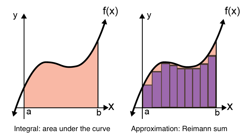
Fig. 19.1 Depiction of integral \(\int_a^b f(x) dx\) as area under the curve (left), and Reimann sum approximation of integral (right). Figure adapted from this website.#
By dividing up the area under the curve into a bunch of rectangles, we can approximate the integral. This approximation is called a Reimann sum, and as the number of rectangles grows, the approximation should converge to the true integral. In high dimensions, however, how many squares would we need? Here are some reimann sums for a 2-dimensional function:
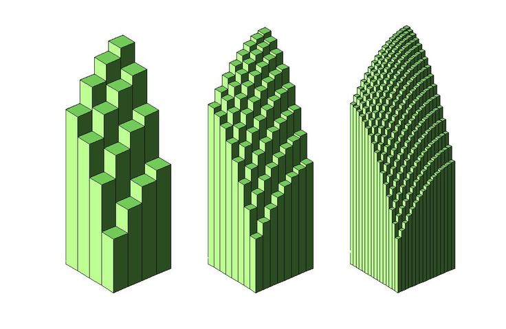
Fig. 19.2 Reimnann sums for a 2-dimensional function from this website.#
If we divided up the input space into \(S\) rectangles in the 1-dimensional case, we’d have to divide it into \(S^2\) rectangles for the 2-dimensional function. And unfortunately, the pattern continues: for a \(D\) dimensional space, we’d have to divide it into \(S^D\). As a result, the cost of this approximation method is exponential in the dimensions of the space. Can we do any better?
Monte-Carlo (MC) Estimate. By re-writing the above integral as an expectation,
we can approximate it by drawing samples from \(p_Z(\cdot)\) and averaging the expression inside the square brackets:
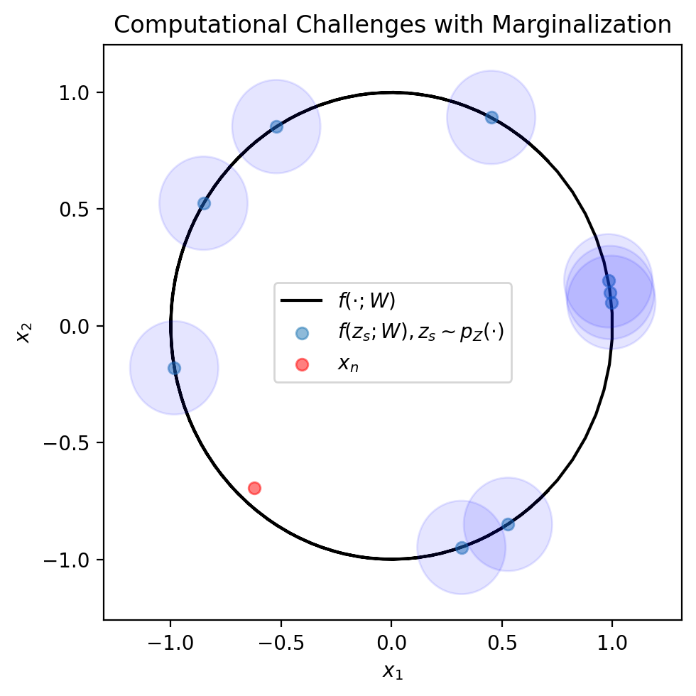
This is known as an MC-estimate. What’s cool about this estimate is that its accuracy is asymptotically unaffected by the dimentionality. Specifically, the approximation improves at a rate of \(1 / \sqrt{S}\) (which is not a function of the dimensionality, \(D\)). As a result, MC-estimates are ubiquitous in probabilistic ML. Unfortunately, for the expectation we have here, even an MC-estimate doesn’t suffice. Let’s see why.
We represent the MC estimate formula visually, using the figure below. This formula tells us we can approximate \(p_X(x_n)\) by drawing a bunch of \(z_s\) (depicted in blue dots), checking the probability of \(x_n\) (red dot) under a Gaussian centered at \(f(z_s; W)\) (blue circles). As you can see, it may take a large number of samples to draw a \(z_s\) whose blue circle hits the red dot. By this we mean, that it may take a large number of samples to draw a \(z_n\) for which \(p_{X | Z}(x_n | z_s; \theta)\) is high.
fig, ax = plt.subplots(1, 1, figsize=(5, 5))

plt.plot(mu_support[:, 0], mu_support[:, 1], color='black', label=r'$f(\cdot; W)$', zorder=0)
plt.scatter(mu[1:10, 0], mu[1:10, 1], alpha=0.5, label=r'$f(z_s; W), z_s \sim p_Z(\cdot)$')
for i in range(1, 10):
    ax.add_patch(plt.Circle(mu[i], 0.2, color='blue', alpha=0.1))

plt.scatter(x[:1, 0], x[:1, 1], color='red', alpha=0.5, label=r'$x_n$')

plt.xlabel(r'$x_1$')
plt.ylabel(r'$x_2$')
plt.title('Computational Challenges with Marginalization')
plt.legend()
plt.tight_layout()
plt.show()
Variational Inference (VI). In practice, we approximate the above expectation using a technique called VI. We will not get into it here, but we will ask NumPyro to use it under the hood. When using VI to fit a Factor Analysis model, we call the overall method a Variational Autoencoder (VAE), which is a very popular generative model. We will use this approach help our IHH collaborators better understand their epidemic.
19.4. Factor Analysis in NumPyro#
Whenever implementing complicated ML models, it’s good to follow these principles:
Implement the simplest version of the model first. This will help you test your conceptual understanding of the model before moving on to a more complicated problem.
Test the simple version of the model on a data set you know it should be able to fit. You can do this by generating data from the model and then seeing if you can fit the model to this data. If it can’t, something went wrong!
Once everything works for the simple version of the model on a simple data, then you can start complicating it.
Finally, when things don’t work, think of all places where things could have gone wrong: bug, modeling assumption, optimizer stuck in local optima, etc.
Complete the exercises below, which follow this principles.
Exercise: Prototyping the Factor Analysis Model
In this exercise, you will fit a simple factor analysis model to the circle data. Before starting to write code, please use the above code to generate a data set of 2-dimensional observations as above.
Part 1: Implement a factor analysis model with a 1-dimensional latent space. Your factor analysis model should use the following decoder function:
where the model’s parameters are \(\theta = \{ W_1, W_2, b_1, b_2, \sigma \}\).
Please use the following function signature:
def factor_analysis_circle(N, x=None):
    pass
Part 2: Fit your model to the data you generated. Use the function cs349_mle_continuous_lvm to perform the MLE. This function will be able to efficiently approximate the intractable integrals. Usage for this function is the same as for cs349_mle.
Part 3: Visualize samples from your model against the observed data. Do they look the same? If not, go back and figure out what went wrong. As you’ve done for previous models, use cs349_sample_generative_process to draw samples from your model.
Part 4: After having gotten the model to work, we can now replace the above \(f(\cdot; W)\) with a neural network. We’ve created a function to create neural networks for you, neural_network_fn. This function will create a neural network for you and register all of its parameters with numpyro.param to simplify your code. You can learn about how to use it by reading its comments in utils.py. Please use the following function signature:
def factor_analysis_nn(N, x=None, layers=[1, 50, 2]):
    pass
Part 5: Fit the model to the data and visualize samples from your model against the observed data. Do they look the same? If not, go back and figure out what went wrong.
Exercise: Implementing a Factor Analysis Model
Now that you have a working implementation of a factor analysis model working on relatively simple data, let’s adapt it to the IHH data.
Part 1: Implement a Factor Analysis model in NumPyro, following the specification below.
Use the following function signature for your model:
def microscope_generative_model(N, x=None, layers=[2, 200, 576]):
    pass
Your latent space should be 2-dimensional.
Name your latent variable
'z'and your observed variable'x'. Usenumpyro.deterministicto name the output of \(f(z_n; W)\)'mu'. This is crucial for the methods that will help you visualize the model. What doesnumpyro.deterministicdo? Notice howcs349_sample_generative_processreturns variables created withnumpyro.paramandnumpyro.sample? This new primitive,numpyro.deterministic, allows you to save all other variables. In this case, since we’re interested in visualizing epistemic uncertainty, we want to visualize \(\mu(\cdot; \theta)\). This new primitive allows us to save it. When callingcs349_sample_generative_process, we’ll now be able to see a new variable calledmu.Your decoder, \(f(\cdot, W)\) should be a neural network.
Remember that each pixel lies on the interval \([0, 1]\). Because of this, you cannot use a Gaussian distribution for \(p_{X | Z}\), since a Gaussian distribution’s support is over the entire real line. You’ll have to use a different distribution. You can find a list of distributions implemented in
NumPyrohere.
Part 2: Fit your model to the IHH data. Use the function cs349_mle_continuous_lvm to perform the MLE. This function will be able to efficiently approximate the intractable integrals. Usage for this function is the same as for cs349_mle.
Part 3: Draw 100 samples from your model. Visualize them using visualize_microscope_samples as we do above. Do your samples look like the data? If not, go back and figure out what went wrong!
Part 4: Now that we have learned a model that represents our data as a “spectrum” in a low dimensional space, let’s visualize what happens as we move along the spectrum. We can do this by choosing two points in the latent space, \(z_1\) and \(z_2\). We will connect them using a line and then decode every \(z\) on that line. You can do this by running this code in your notebook:
z1 = jnp.array([-3.0, -3.0])
z2 = jnp.array([3.0, -3.0])
animate_latent_space_path(result, z1, z2)
Here, result is the output of cs349_mle_continuous_lvm. Make sure the call to animate_latent_space_path is the last line in its cell.
Play around with different choices of \(z_1\) and \(z_2\). What do you notice about the images generated along the path in the latent space? Do the “axes” of the latent space have any meaning?
